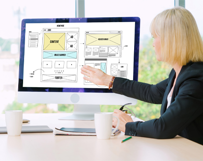
What is the first thing that grabs your attention when you visit a website? It’s often the page’s header, which appears at the top. The title is the first thing everyone sees, much like the first page of a book. It’s where they learn about the business, get an overview of the products, and find the call to action. This seemingly little section at the top is very crucial.

So, how to design this crucial part of your website to make it more appealing? You can maximize its potential by giving it a custom design.
The blog discusses some great examples of website headers and discusses some of the most important best practices to remember while designing your own.
What is a Website Header?
The header of a website is the visible portion at the top of a page. It’s a narrow bar at the top of the screen where interactive elements like a logo and navigation buttons reside.
What does the Website header do?
- Navigation: It makes it easy to get around the site. When you press a button, you’re sent to a new section.
- Marketing: A well-designed header may help advertise a company’s name and products. So, it’s not just for show; it’s a practical tool for improving websites’ functionality and aesthetic appeal.
What are the Key Elements of a Website Header?
The header is a crucial part of every website. Some common elements of a header are listed below:
- Logo
- User Account
- Call-To-Action
- Essential Text
- Menu and Navigation
- Search Bar
There may be a shopping cart, social networking buttons, language selection menus, etc., in specific headers. It depends on what kind of website it is and what essential things people should be able to view.
5 Tips for Effective Website Header Design
An attractive header can do wonders for both user experience and brand awareness. Half of visitors to a website only stick around for up to 15 seconds before clicking away. The website’s complexity and poor usability are likely contributing factors.
One easy first step you can do to fix this and keep more clients is to make sure your website’s header design doesn’t turn people off. Look at the five tips to follow while creating an attention-grabbing header for your website:
01. Pick a Suitable Font
The header’s visual appeal is greatly affected by the typeface you choose. The header may include crucial information, so ensure the typeface is legible. It must stand out from the crowd.
Make your title stand out and follow current design trends with a bigger font size. Strong sans-serifs and refined serifs may be effective, depending on the tone you want to set for your business.
The font used for the header affects its legibility and visual appeal. If the font and content are readable, you can easily keep the website visitors stuck to the website and reduce bounce rates.
02. Use Visuals
Increase the attention and emotional appeal of your header by adding images. Typically, a picture or video will serve as the hero of your title.
Visuals are a great way to humanize your website and swiftly explain your product’s value to your visitors.
Take into account the following while creating your header:
- Pictures and animations: Your website’s illustrations should complement the site’s aesthetic and communicate clearly. Stay away from images that are too complicated or abstract. Animated media may be both engaging and fun to engage with.
- Photos: Using authentic images may give your website a more friendly and approachable vibe. You need high-quality photographs to make an impression and grab people’s attention. With a transparent backdrop, the picture itself is the focal point.
- Videos: These days, more and more people watch videos online. Captivating visitors and rapidly explaining your value proposition may be accomplished with a short film showcasing your organization, product, or staff.
Visuals should be utilized sparingly, adding value rather than distracting from the overall experience. Think about how your chosen images complement your brand and the message you’re trying to send.
03. Use a call-to-action (CTA) to get users interested
Call-to-action buttons are crucial to get people to do things like join up, get in touch, or begin a process. It’s essential for a call to action to stand out, be concise, simple to find, and convey its purpose. Considerations such as button size, location, and color are crucial.
Recommended actions include the following:
- The call to action should stand out from the other header components.
- The call to action should be clear and easy to follow.
- It should be easy to find and see without browsing too much.
- The call to action (CTA) should be prominent in your header and one of the first things visitors see when they arrive on your page.
04. Simplify Search and Navigation
Maintaining user interest and avoiding their departure due to frustration with poor navigation is paramount. The goals you want to achieve with your website will determine how you structure its menus, links, and search bar.
Take a look at these navigation options:
- Hamburger Menu: Using this method, you may cloak your menu’s links in an image. Taking this course of action might free up space in the header for more essential features, such as a call to action or a video introduction.
- Visible Menu: Some sites must always have direct access to specific URLs. Maintain an open menu with quick access to items in this situation.
- Vertical Menu: A left-aligned vertical menu might be helpful if you’re short on room at the top of the page or if the design of your site requires it. Be sure to include relevant keywords and make them easy to find.
Your site’s navigation should be straightforward, allowing customers to find what they’re looking for quickly. Visitors may get frustrated with a site if it has fewer links or needs to be better organized.
05. Try New Things While Sticking to the Best Methods
Finding the sweet spot between originality and usability is critical if you want your website to stand out. Make sure the style of your header reflects your business’s aims, the nature of your website, and the demographics of your site’s visitors.
Stay away from typical design mistakes:
- Too many buttons: Keep the number of links in your header to a minimum to avoid overwhelming your visitors. Prioritize the most important things you want your visitors to do.
- Complex Structure: You shouldn’t include the whole sitemap in the header. The header should be simple and easy to use, highlighting essential goods and menu elements.
Using these instructions, you can design a header that looks good and improves the user experience, which in turn helps your website and brand succeed.
Top 10 Website Header Examples for Inspiration
01. Airbnb
Airbnb’s header is a model of simplicity and ease of use. Users may get a feel for the service via its search features without joining up immediately. The search bar, motto, and catchy CTA in the clean and uncluttered header effectively present the platform’s value.
02. Intercom
Intercom has kept the header simple deliberately, as they want to draw people’s attention only to the call to action. The phrase does an excellent job of conveying the service’s goal. While the absence of visual clutter helps the user concentrate on the message they want to share. The drop-down options also help organize the features into easy and more digestible chunks.
03. Synthese
The header of Synthese has eye-catching 3D animation in line with modern UI standards. They have used geometric forms, bright colors, and primary 3D effects that keep users interested and entertained. Users may click the prominent symbol in the top right corner to access the menu or search bar.
04. Toyota
Toyota’s homepage hero block has a video presentation. It is a great example showing visual material’s importance over words. The two-tiered horizontal navigation provides easy access to the site’s many features.
05. Ikea
Ikea’s advertising website header highlights these qualities as its top priorities. The CTA is up and center, letting new users immediately get on board. The title is simple since it just contains the most essential details about the organization. A hamburger symbol covers the menu so as not to detract from the primary function.
06. Apple
Apple has always been an inspiration for effective marketing of products. The header of Apple’s website is sleek and simple like its laptops and phones. They have included a detailed product presentation and menu choices in the title. The design stresses the graphics of the product while looking modern and catering to the end user.
07. Dropbox
The header of Dropbox is an excellent example of the effectiveness of a simple layout. They have kept the title design simple to make it easy for people to create an account or log into an existing one. The header’s minimalistic design continues with a simple menu and search field.
08. Nike
Want to see an example of minimalist elegance and powerful effect? The Nike website header is perfect. Large, high-quality images of its products take center stage. Users can effortlessly navigate Nike’s offers because of the well-structured menu.
09. Amazon
The header of Amazon.com has become a symbol of the design skills of a major online retailer. It prominently displays the brand’s logo and has an extensive menu that makes browsing the site’s many offerings a breeze. Thanks to the prominent search bar placement, users can quickly and easily locate what they need. Amazon’s header is a model of efficiency and clarity in presenting various products without sacrificing usability.
10. Google
Google’s website header design is minimal and practical. You’ll see the Google logo and a single search box on a pure white header. The design reflects Google’s dedication to providing a user-friendly and effective search experience. Despite its spare look, Google’s header shows the vastness of the internet very well.
Conclusion
A header functions similarly to a business card for a website. It should be distinct, simple to read, and grab the attention. If you are designing your website header, you can follow the tips from the article. In addition, your website design needs constant updates to keep it relevant to the current trends.
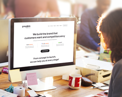
If you want to design a beautiful and engaging header for your website, Graypple design studio can help you out. We are a top web design agency serving hundreds of clients globally. With an experienced team of web designers, we can help you elevate your website designs and boost website conversions.
FAQs
Why is it essential to have a header on a website?
The header of a website performs two essential functions: it directs visitors throughout the site and advertises the business brand.
In your opinion, what makes a good header?
An effective header design has legible fonts, images, compelling calls to action, streamlined navigation, and some degree of creativity that do not compromise the ease of use.
Can you provide any instances of popular websites with attractive headers?
Certainly! Airbnb’s emphasis on the customer, Nike’s focus on showcasing products elegantly, and Google’s concentration on search functionality all have minimalist designs.