Dashboards are an extraordinary means to convey data-driven insights with data visualization methods. A business dashboard should be user-friendly, serving as a fundamental tool in the decision-making process. Adopting the right approach to data visualization is pivotal for laying the groundwork for effective dashboard design.

Marketers use data dashboards to monitor customer satisfaction, web statistics, and social media influence. Sales teams appreciate financial charts. Stakeholders and founders gain insights into company growth possibilities through bar graphs and tables.
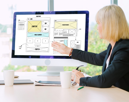
However, designing a dashboard is a complex task. With this blog, you help you design interactive dashboards. Read the blog for fundamental design examples and inspirations.
What is a Dashboard?
Dashboards serve as the platform to display data visually. The versatile tool presents key information in one place, like Key Performance Indicators (KPIs).
Dashboards retrieve data from connected databases and allow users to select the specific information they wish to view. Including graphs or charts enhances the ability to easily grasp and analyze numerical insights.
Managers often seek a clear view of business performance and a sturdy foundation for team decision-making. Dashboards offer an excellent solution. They visually portray data, focusing on offering quick insights, like KPIs. They have separate pages pulling data from linked databases, and they’re customizable, letting you pick the info you want and incorporating graphs or charts for data visualization.
The Importance of Dashboard Design
A thoughtful dashboard design creates an ideal setting for engaging audiences with analytics, rendering it more effective.
Using static reports or lengthy Excel sheets packed with tables and formulas can be confusing, especially for non-tech individuals. This complexity may lead to misunderstandings and the formation of incorrect strategies in conveying accurate information.
Carefully designed dashboards remove these challenges by providing a user-friendly display of vital business data in a manner that anyone can grasp.
Different Approaches to Dashboard Design
Data dashboards have diverse functions and serve various purposes. They are highly adaptable, mostly finding use in business intelligence.
Generally, there are three types of dashboard designs:
01. Operational Dashboards
These are the most common and provide real-time data for operational decisions. They employ dynamic analytics to assess information, using key performance indicators (KPIs) and other essential metrics. They are used to track real-time or transactional data against crucial metrics and KPIs, with updates occurring frequently, possibly even up to the minute.
Dashboards facilitate immediate responses, making frequent updates and timely adjustments vital. For instance, IoT dashboards monitor real-world processes, allowing you to address issues without leaving your location.
In simpler terms, data dashboards are like multitool instruments, primarily employed in business intelligence. Operational dashboards, in particular, keep you informed in real-time and are tailored to your daily tasks, ensuring you can address issues promptly.
02. Analytical dashboard
An analytical dashboard gives you a snapshot of essential data, constantly comparing it to how things were before. These dashboards focus on data and try to show as much valuable data as possible. They go through a lot of data and help you see trends, make predictions, and find insights. You can use these insights to set goals based on past data.
Analytical dashboards help department heads and senior managers to understand the massive data. The key feature of an analytical dashboard lies in its fondness for historical data. Analytical dashboards aim to reveal all needed info for spotting trends, comparing elements, fiddling with variables, and predicting outcomes.
Users must time-travel with data to pinpoint links between performance shifts and corporate actions or external factors like economics, seasons, etc. It helps grasp the now and unravel performance trends and paves the way for forecasts. Unlike other dashboards that offer quick decision aids, analytical dashboards use visuals to separate vast data, allowing deeper exploration and inquiries.
03. Strategic dashboards
Strategic dashboards play a crucial role in long-term decision-making. They offer a broad perspective on essential data, combining KPIs from different departments. These dashboards provide a retrospective look at performance indicators.
Strategic dashboards serve the needs of internal business management. Executives use them to track Key Performance Indicators (KPIs). Unlike operational dashboards that update frequently, strategic dashboards have less frequent data updates. They are meant to be checked once a day, aiding executives to monitor organizational KPIs. Often, strategic dashboards summarize performance over more extended periods like months, quarters, or years.
Tips for Effective Dashboard Design
Creating exceptional dashboards necessitates both simplicity and a structured approach. Achieving this design goal may pose a considerable challenge. An organized procedure guides you toward success, ensuring all critical steps are noticed.
The metrics and key performance indicators (KPIs) you opt to monitor become the bedrock upon which your dashboard rests. Before, only data experts made these dashboards. But now, tools like PowerMetrics make it possible for anyone, like marketers, founders, and bosses, to create one.
In Google Analytics and similar dashboards, the main focus is on crucial account data, and they use fewer pictures. These dashboards help you find issues in your application and make fixing problems easier.
Simplicity
Striving for simplicity remains essential. Overwhelming users with an excessive surge of information hinder comprehension and processing.
From a design standpoint, eliminate superfluous elements devoid of practicality, such as decorative embellishments and chart grids. A numerical representation provides equivalent information within a more compact space in this context. Consequently, dashboard real estate should not be wasted on elements solely intended for visual aesthetics.
Keep the audience in focus
When crafting your dashboard, constantly tailor it to your intended audience. An effective dashboard conveys a clear message; it’s a communication tool, and successful communication starts with understanding your audience.
From the outset, grasp who will use your dashboard and how. Depending on the audience, your dashboard might be accessed on mobile devices, web browsers, or even TV screens. These factors matter when you embark on dashboard design.
Keep in mind, you’re developing a product for people. Use the principles of human-centered design. Delve into users’ needs and challenges, striving to offer the most user-friendly solution. While creating a visually captivating layout is essential, it must be coupled with a convenient, user-friendly interface to gain popularity with users.
Furnish Fundamental Data
A top-notch dashboard design must display pertinent information in a plain, user-friendly format. Avoid crowding your dashboard with excess data. Instead, maintain simplicity and eradicate redundant information. Utilize white space judiciously, allowing users to quickly grasp the data’s structure.
Moreover, leverage color strategically to captivate the viewer’s attention. Consider adopting a minimalist approach rather than saturating your design with vivid hues.
Categorize and Label Information
The more data you present, the more challenging it becomes to comprehend. Hence, it’s imperative to segregate it into logical clusters, facilitating seamless interaction between the user and the dashboard. Think of your smartphone, where functions are grouped into categories, forming larger sets. Finding a particular position would be an arduous task if they were arranged in an alphabetical jumble.
Gather and label interconnected metrics and KPIs in your dashboard’s composition, ensuring users can swiftly locate them. You can categorize data based on department, region, campaign, product, and more, experimenting before finalizing your arrangement.
Establish a Readable Data Framework
Once you’ve discerned the data’s broader purpose at the macro level, delve into the finer details of their management.
Employ visual language and an intuitive interface to facilitate user navigation through the data. As previously mentioned, prioritize the main metrics and figures. Structure the information so that the most pertinent data is readily understandable. Strive for consistency in data presentation patterns. We strongly recommend the development of a brand design system for this purpose.
Test, Assess, and refine
As you and your team engage with the dashboard, valuable feedback will emerge, enhancing its utility and effectiveness. User-generated insights empower you to make improvements that benefit your entire team or organization, aligning with your audience’s objectives. Don’t hesitate to seek feedback—it elevates your dashboard creator and designer proficiency.
Best Dashboard Designs to Inspire You
Data visualization leverages graphics and imagery to assist decision-makers in determining patterns and learning complex concepts often obscured in text-based formats.
Nevertheless, crafting a well-structured dashboard proves more challenging than it sounds. In tailoring a bespoke dashboard, we can select the key metrics vital to our business and configure them suitably. This yields a single screen housing frequently requested data, user insights, KPIs, metrics, and other analytical information crucial for business growth.
Some inspiring examples-
Financial dashboard
A financial dashboard must be flexible and offer deep insights into expenses for real-time management by finance managers. It features navigation, account status, dynamic icons, recent expenses, and a shortcut for sending money to contacts.
Media And Telecom
The dashboard reveals essential KPIs for streamlining processes, navigating market changes, and boosting customer loyalty. It follows the inverted pyramid concept, showcasing critical data upfront and offering insights into various channels and resources for knowledge acquisition.
Sales Mastery
Sales teams thrive on accurate, easily accessible data. The dashboard distinguishes three main groups clearly: performance, activity, and engagement. Colors strategically ungroup data. Regular updates and in-depth digital marketing analytics are invaluable for business growth.
Property
Real estate agents need a property dashboard for efficient data management. This dashboard streamlines sales activity, calendar synchronization, and appointment bookings. Bold infographics represent money flow, vital information, and housing details to accelerate the work.
Health
Healthcare apps require precise, user-friendly designs. This mobile healthcare dashboard presents real-time health status, including calories burned and heartbeat rate. Quick action buttons enhance navigation.
Educational
The educational dashboard simplifies daily task management. It displays the to-do list, completed task count, and tracked time with well-organized color coding.
Device
Device control dashboards simplify managing electronic devices. They offer detailed information and responsive controls. This dashboard streamlines connection with various gadgets, displaying device details, battery status, and usage.
Communication
The dashboard eases team communication and task management. It presents critical data, activity metrics, top performers, and brief channel information for smoother collaboration.
Conclusion
In this digital age full of data, a good dashboard design must be simple and easy to grasp, with a touch of creativity. They excel in user-friendliness and minimalism, making data navigation and customization a cakewalk.
If you want to craft a superb dashboard with a user-friendly approach, you need to partner with a top UI/UX designing agency. Graypple Studio has an experienced team of designers that can help you design modern and interactive dashboards for your business. Contact us today to share your needs and get a quote.