SaaS (Software as a Service) has rapidly grown into an important player in the IT sector, and businesses of all sizes are quickly adopting it. If you want to make an excellent SaaS product, the design of your website should be one of the first things you think about.

Why?
To attract and retain clients, you need a website that does more than look nice. A well-designed SaaS website should convince visitors that your service is essential for their own needs, whether those needs are professional or personal.
The blog will discuss the key aspects of designing a SaaS website and provide 20 outstanding examples of SaaS websites now setting the standard in 2023.
What is a SaaS Website?
As an online shop, a SaaS website is like the front desk of a software company. It’s where you learn about and access all of their digital offerings. When we talk about “SaaS,” we refer to web-based applications like Google Workspace and streaming services like Netflix.
This website is where the business describes the features and benefits of the software as well as its target audience, its method of functioning, and its price. It’s not just facts, though. The purpose of the site is to generate enthusiasm for and interest in their product and ultimately encourage you to give it a try.
SaaS can be thought of a virtual tour guide who makes you feel welcome by showing you around their product, telling you why it’s great, and answering any questions. Therefore, a Saas website is an online center where you can learn about and, if interested, utilize these convenient online solutions.
What are the Benefits of SaaS Websites?
- Clear Product Presentation:
Software as a service (SaaS) websites act as virtual storefronts, showcasing the service engagingly and simply. They provide a clear introduction to the features and capabilities of the product via attractive design, engaging content, and simple navigation. This lucid demonstration aids site visitors in rapidly comprehending the SaaS offering.
- Customer Engagement:
SaaS websites encourage interaction by providing live chat support, faqs, and contact forms. They facilitate prospective clients’ ability to ask questions, get answers, and get help quickly. This engaging method makes customers feel cared for and motivates them to dig further into the SaaS offering.
- Streamlined Updates:
With SaaS websites, upgrades and modifications happen automatically. The service provider handles all updates, so the user never has to worry about getting or installing them. By doing so, users are automatically updated to the newest version, including bug fixes and security improvements.
- Responsive Design:
SaaS websites are often developed using responsive design concepts. In this way, the website’s usability is maintained regardless of the device used to view it (PC, tablet, or smartphone).
- Collaborative Features:
Collaborative tools and features are available on many SaaS websites. It is especially useful for organizations and distributed teams to have access to these features since they allow several people to work together in real time, exchange data, and collaborate on projects.
- Scalability:
It’s easy for SaaS websites to adjust to users’ evolving requirements. Businesses can add or remove people and features as needed, which gives them flexibility and cost-efficiency.
Best Practices to Design a Successful SaaS Website
Designing a successful SaaS website requires following fundamental best practices to guarantee a positive user experience. Some of the best practices are:
- User-Friendly Design:
Your website has to be user-friendly. It should be easy for visitors to find what they need when they come. People may only stick around if it’s easy to navigate or chaotic. Make sure your website is simple to navigate so that visitors can get the information they want quickly and easily.
- Clear Navigations:
Even if your website isn’t packed with content, it still has to be organized in a way that lets users quickly access the information they need. Here, it would help to put important buttons and links, like “Sign Up” or “Start Free Trial,” where people will likely see them. To keep these alternatives in view, many SaaS websites use “sticky” headers, which don’t disappear as you scroll down the page.
- Attention-Grabbing Buttons:
Buttons that prompt users to act, such as sign up, should be highlighted. They are often placed toward the page’s top to facilitate the next logical step for the viewer. To ensure that users notice these buttons, they must stand out visually.
- Instant Product Introduction:
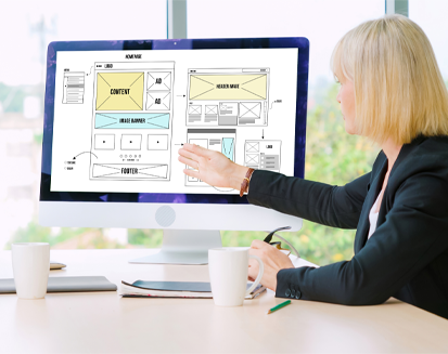
Many visitors to your SaaS website won’t have much background knowledge about the service you’re offering. Quickly demonstrating your value to potential customers is crucial. Using an eye-catching image, an easy-to-understand title, and a confident declaration about your product’s worth are common methods. You want people to visit your site and realize why it’s important.
- Features and Benefits:
The advantages of your product should be laid out in detail for potential customers on your website. Make sure they get only a little information at a time. Fairly present the important parts, and use pictures or videos to show how things work. This gives prospective buyers a clearer picture of what they’re getting.
- Customer Review:
It can make a big difference to have good reviews from happy customers. Customers are more likely to buy your goods if they read positive reviews written by real consumers. User reviews might be more persuasive than any marketing claims you make for your business.
Top 20 Successful SaaS Website Examples
Let’s look more closely at each of the SaaS website examples to learn more about their distinctive layouts and what sets them apart:
01. Dropbox
Dropbox’s website is well-known for its user-friendliness and minimalistic design. The major emphasis is highlighting the service’s primary benefit, which is effective file storage and sharing. The basic features are organized clearly in the burger menu, making it simple to find the information you need. The 2017 rebranding of Dropbox introduced a welcome shift with its use of vivid colors and bold fonts, helping to make the brand more memorable and engaging.
02. Shopify
Shopify’s website layout is focused entirely on getting users to join up for a free trial. The website’s design contains a strong prompt to initiate action. The eye-catching USP grabs attention, and a sticky header makes it easy to access the most relevant links at all times.
03. Slack
The website for Slack stands out due to its user-friendly design, robust search tools, and simple navigation. The platform’s integrations are highlighted, with an emphasis on streamlined communication. New users may join up for Slack quickly and effortlessly using their existing Google accounts, thereby streamlining the registration process.
04. Spotify
Spotify’s website was built to provide each visitor with a unique experience. It makes the service seem more relevant right away by providing users with playlists depending on their location. Spotify’s prominence in the world of entertainment is reflected in its design, which is cutting-edge and colorful. To stand out in the competitive music streaming industry, it uses a wide range of shapes, colors, and creative elements.
05. Medley
The Medley website is an excellent illustration of how to attract and retain visitors using engaging content and an attractive layout. The homepage’s minimal navigation bar makes it easy for visitors to find what they want. Visitors may learn more about Medley and how it can help them as they scroll down the page.
06. Intercom
The website for Intercom’s messaging platform is an example of user-friendliness and efficiency. The homepage does a good job of explaining what makes the brand special. The website is visually different because of the vivid colors and animated drawings of the characters. Photos taken by actual users demonstrate a human-centered strategy, while concise headings guarantee the message is easy to understand.
07. WooCommerce
The homepage of WooCommerce is dedicated to demonstrating how simple it is to create highly functional online stores. It provides:
- Interesting case studies.
- An obvious call to action.
- An easily readable summary of the platform’s features.
The website gains a more human, familiar feel by adding real photos of customers and workers.
08. Loom
This website for Loom’s video chat tool has a simple layout. It is user-friendly and interesting since it is independent of words to communicate the product’s advantages and features. To further illustrate the use of the product, animations and cam video features are included in several displays.
09. Kissmetrics
Kissmetrics, an analytics tool for product and marketing, has a clean and accurate user interface. The website’s chatbot offers instantaneous help, and the site makes a smart analogy between its service and Google Analytics to emphasize the advantages of using it. This method ensures that site visitors immediately grasp the benefits of using Kissmetrics.
10. Sprout Social
The website for Sprout Social’s social media management system has a prominent call to action, highlights reputable companies that utilize the software, and explains how its customers may benefit from analyzing social data. The website uses cutting-edge UI/UX practices to increase user interaction and feature video reviews from satisfied customers.
11. Mailchimp
The email marketing provider, MailChimp’s website stands out because of its eye-catching graphics and clear calls to action. The layout does a good job of explaining the service’s capabilities and the advantages it provides to commercial clients. The brand identity is defined by vivid colors and funny graphics that provide a distinctive and well-rounded user experience.
12. Bench
Bench is a business-to-business software as a service (SaaS) platform that provides accounting services. The site’s design emphasizes trustworthiness, precision, and reliability. The platform’s functionality is clearly and concisely explained. You may learn more about the features of the support system and read testimonials from satisfied customers by visiting the website.
13. Canva
Canva’s homepage does an excellent job of conveying the site’s intended audience — those who are not trained as designers — and the platform’s accessibility. The website is user-friendly and provides a thorough tutorial to assist consumers in rapidly getting started with the service. The layout is simple, which facilitates quick and easy training.
14. Notion
The website for the productivity software Notion successfully mixes a clear layout with captivating monochrome images. It has a balanced design that inspires confidence and consistency, and it has received praise from renowned clients. The layout was made with the user in mind, making the whole experience simple.
15. HelloSign
The online e-signature company HelloSign, recently bought by Dropbox, has a straightforward and business-oriented message for its site users. It describes the product’s capabilities and how they will be useful to customers. The website’s layout is well thought out and easy to navigate.
16. Figma
Figma is a popular design tool for teams working on graphics, prototypes, and collaboration. The company emphasizes the value of teamwork on its website. The importance of the tool to designers is well conveyed via inventive animations and images. Because of its adaptability and uniformity, the design system may be easily modified and updated.
17. Salesforce:
Salesforce, a popular CRM software, has an approachable UI and provides examples that allow users to explore its features first. The site highlights the benefits of CRM for organizations, showcases the experiences of satisfied customers, and offers a plethora of useful tools and information to its visitors.
18. Zoom
The website design for Zoom, a popular video conferencing software, prioritizes ease of use and accessibility. Signing up is quick and easy, and the platform’s benefits for teams working remotely are explained in detail via webinars and detailed guides.
19. HubSpot
HubSpot is a company that makes tools for inbound marketing and sales, and its website does a good job of explaining what it offers. It provides:
- In-depth manuals and training for digital marketing and sales professionals.
- Free tools and resources.
- Client testimonials.
20. Zendesk
Zendesk, a platform for providing customer care and assistance, has a user-friendly and minimalistic website. It does a good job of conveying its primary value, providing superior customer service for enterprises. The website has user success stories, helpful articles, and an easy-to-use interface. It demonstrates how Zendesk’s products may improve the efficiency of customer care operations, making Zendesk a leading alternative for organizations needing effective support software.
These SaaS websites are well-designed because they prioritize ease of use, clearly communicate the value proposition, and encourage users to join or explore the features. Each layout is consistent with who the brand is and who they want to attract, making for a pleasant and interesting experience overall.
Conclusion
These are the top SaaS apps for 2023 that provide examples of how to create a professional, engaging, and well-rounded online brand. Each one serves as an example of the importance of design, user experience, and clear communication in the growth of the SaaS market.
If you want to build a SAAS application for your business, we have the right expertise and services to offer. Our SAAS experts design the solution with a one-of-a-kind approach that helps you stand out. Contact us today to get a free consultation.
FAQs
In 2023, why are SaaS websites so crucial?
In 2023, SaaS websites will continue to play a vital role in expanding the SaaS market as they efficiently convey the value of a SaaS product, captivate visitors, and motivate them to take action.
How should a SaaS platform’s website be created?
Important website design principles for software as a service (SaaS) include:
- User-friendly interfaces.
- Simple navigation.
- Conspicuous calls to action.
- Prompt product introductions.
- Well-balanced feature descriptions.
What is the importance of user reviews on SaaS websites?
Customers are more likely to subscribe to a SaaS when they read positive reviews and testimonials from users who have experienced its usefulness.